Fifty Shades of Black
The Fine Art of Fashion
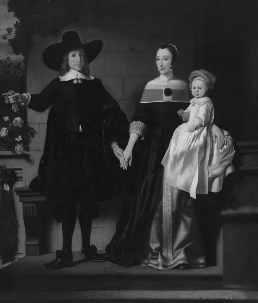
If you wander through a gallery of 17th-century portraits, you might notice that the subjects depicted by Rembrandt, Gerrit Dou, Frans Hals and others are all wearing black. In fact, black is still the fashion colour of choice in the art world. For a long time it was believed that black attire was a sign of sobriety and puritanism. But now it seems it was just the opposite: black was an expensive, ostentatious colour.
In 1647, an English soldier, lexicographer and cultural mediator by the name of Henry Hexham published an ambitious dictionary, itemising and categorising many things he discovered in Holland. A Copious English and Netherlanduytch Dictonarie …with an Appendix of the names of all kind of Beasts, Fowles, Birds, Fishes, Hunting and Hawking, included precious stones, herbs, and various colours of natural dyes employed in the Dutch linen trades.
Among these colours were at least a dozen shades of black, which turned out to be a rather dizzying array of now lost hues, including ‘black and blew’, ‘black like pitch’, ‘a smokie colour’, ‘somewhat black’, ‘bright black as the colour of a crowe’, and the wonderfully resonant colour ‘bleake’.
This profusion of black natural dyes in the Netherlands indicates, according to Rijksmuseum costume historian Bianca du Mortier, ‘how exceptional the knowledge and skill of dyers was in our country’, during the 17th century, as she wrote in an essay on the subject for the catalogue to accompany this winter’s Ode to Dutch Fashion exhibition at the Gemeentemuseum in The Hague.
Because, she explains, ‘hardly anyone knows that our country was, for centuries, famous throughout Europe for its beautiful, deep black coloured woolen cloth.’ Dutch black wool, in particular, was exported all over the world, to Spain, Portugal, Italy and France. Of course, it was used widely at home as well.
Look at almost any of the 17th-century Dutch portraits in the Rijksmuseum, explore the Portrait Gallery of the Golden Age at the Amsterdam Hermitage, visit the Mauritshuis, the Amsterdam Museum or take a look at almost any Rembrandt, Gerrit Dou, Nicholas Pickenoy or Frans Hals portrait in any museum, and you’ll quickly notice a sartorial trend: everyone is wearing black.
Expensive dyestuffs
This trend extends not only across the 17th century portraits. In many ways, it still exists today. Black attire is the uniform of the art world, as anyone who’s ever been to an art opening knows.
Black is also still the colour of choice in formal dress, and every stylish woman these days has at least one ‘little black dress’ in her closet for special occasions. For many years, it has been assumed that Dutch people in the 17th century chose to wear black because they were Protestants, and black is a modest colour, suggesting austerity and sobriety. Because it was colourless, or ‘bleake’, it was also thought to represent frugality, since surely brighter, lovelier hues were more expensive than plain and demure black.
‘I think it was just the opposite’, Du Mortier tells me in an interview. ‘Black was the most expensive colour to dye, it’s a very laborious process, and it takes a long time. Plus, the guilds were adamant that the black had to be perfect. It couldn’t be exported unless it had that top quality seal.’
The reason so many quality fabrics were produced in Holland, Du Mortier went on to explain, was that the dyeing of black cloth required the combination of several colours, many of them imported from distant shores. Deep black natural dye often demanded the use of indigo, which comes from India, and cochineal, a natural carmine dye made by crushing great quantities of female beetles that live on a particular type of cactus found on tropical plants in Central and South America. Because Amsterdam was the major European port during the Golden Age, dyers in the Dutch Republic had exceptional access to all these natural dyestuffs.
The Dutch guilds also specialised in establishing high standards for black dyes, with their own special recipes. Each year in each town, the local guild requested samples from dyers, and from these established a standard black colour, which all other dyers had to comply with. Dyeing of cloth was done under the strict supervision of the drapers guilds in textile towns such as Leiden, Haarlem and Amsterdam.
In addition, Dutch weavers used premium wool bought from England and other European countries, thus allowing for soft, pliable fabrics, which, after dyeing, were exported to countries such as Burgundy, Spain and Italy ‘where black and other dark colours were considered to be particularly appropriate for courtiers and gentlemen’, Du Mortier explained. ‘And since it was an expensive colour due to the complicated process, only the wealthy could afford it.’ A single black gown, for example, could cost 50 to 100 guilders – about the price of having a professional portrait painted for you by Rembrandt.
Lace and Pearls
Du Mortier, after several years of research, posits that the reason that Dutch portraits of the 17th century feature so many people wearing black is that when the Dutch became wealthy during their Golden Age, they flaunted their wealth by wearing black clothes, which were considered luxurious then and – as they still are today – often regarded as their fancy, or ‘black tie’ garments, as it were.
‘I truly believe it’s showing off’, she says. ‘Even if you look at the lace and the jewellery, it all adds up. It’s certainly not modesty – this is a myth. Because imagine these are people, some of them immigrants who fled France or Flanders, who have come to the Netherlands where they worked very hard, and finally, they have money. What do they want to do? They show it off. They buy very expensive lace, huge pearls, and what they then do is dress in black.’
Du Mortier is not the first scholar to make the assertion black was not considered compulsory for the faithful. Costume historian Irene Groeneweg originally countered the myth of ‘sobriety’ around black clothing in a 1995 article in the Nederlands Kunsthistorisch Jaarboek, pointing out that from the Middle Ages through the 17th century there were periods when bright, colourful clothing was fashionable, which alternated with periods when black clothing was in fashion.
Art World Chic
Historian Benjamin Roberts explains in his book, Sex and Drugs Before Rock and Roll: Youth Culture and Masculinity During Holland’s Golden Age: ‘Bright, colourful clothing was often worn by young people and considered leisure wear, whereas the black attire worn by adults was considered business apparel similar to a black suit for official engagements.’
Emilie Gordenker, director of the Mauritshuis Royal Picture Gallery in The Hague, also explored this topic in her book, Van Dyck and the Representation of Dress in Seventeenth-Century Portraiture (Turnhout, 2001), pointing out that early 17th-century painter Anthony van Dyck helped establish some of the conventions of dress in portraiture. One of these was a mixing of ‘fact and fancy’ – that is, the sitter could be presented in a portrait to some fictional effect.
The Mauritshuis halls are full of images of 17th-century noblemen, guild members and merchants in black attire, specifically for this reason. ‘It was most common for people to have themselves portrayed in their “Sunday best” and that was most often black’, she explains.
This was even true for artists when they portrayed themselves, she continued – even though we might expect to see an artist at work wearing more leisurely attire or even a painter’s smock. ‘You rarely see anyone depicted in the sloppy studio garb that they must have worn to do the actual work’, she says. ‘They usually depicted themselves in very distinguished-looking clothing. Artists in this period were just establishing themselves as fine artists rather than craftsmen, so they wanted to project an educated, distinguished air. Clothing is a very good way to do that.’
For example, the rare female 17th- century painter Judith Leyster painted an image of herself in 1640 (part of the National Gallery of Washington collection) in which she’s holding an easel and sitting in front of a canvas, while wearing an elegant dress with a fitted, sheen black bodice with burgundy coloured sleeves and an enormous, but gracefully thin lace neck ruff. ‘She’s presenting herself in silks with rich fabrics, which is completely inappropriate for painting, and yet she’s shown herself at her easel’, said Gordenker. ‘It’s all about presenting an image.’
Relief in the fabric
Black, continues Gordenker, is the colour of choice for artists, but with them, too, there are many different shades of black – with different hues used to indicate the quality of the fabric the sitter was wearing, from satins and silks, to thicker wools. The quality of the fabric depicted can indicate the social status of the wearer, and the mastery of presenting these subtle textures in oil paints is also a measure of the technical skills of the painter.
To see the differences between all these figures in black, Gordenker suggests, ‘look at the way the fabric is worked. If you look at early Rembrandt, it’s very carefully worked, but in late ones, the painting style changes and it’s very loosely done. If you look at some of the artists like Thomas de Keyser, they’re interested in the detail, the brocades of the fabric, the fringes, because these details are very subtle and it’s hard to depict nuances’.
Although many shades of black were created by Dutch dyers, it’s difficult to tell which hues were considered the most valuable or which would have been seen as most prestigious, says Du Mortier. And because there are very few remnants of actual cloth fabric left from the 17th century, it’s also hard to tell what the black really looked like. We can imagine it somewhat based on paintings, she explains, but paintings only tell part of the story, because artists create their own black pigments using mixtures of paints – usually created with a substance called ‘bone black’, a char made of de-oxidized animal bones.
With clothing, she says, ‘there are lots and lots of different shades of black, but it doesn’t have to do with social standing. It’s just that the Dutch dyers specialised so heavily in black that they could offer so many different shades.’
CASUAL COUTURE
The focus on black as a colour choice continues throughout the history of Dutch fashion, says Madelief Hohé, fashion curator for the Gemeentemuseum, and curator of the exhibition Ode to Dutch Fashion. ‘On the one hand Dutch fashion is almost childlike in its use of bright colours, and on the other it’s all black and white’, she says. This, of course, goes back to the shifting colour trends in fashion dating back to the Middle Ages, as noted by Roberts.
‘In contemporary fashion design, black is more like a game between white and black’, she explains. ‘For instance, if you look at Viktor & Rolf they are making references to the 17th century. And if you look at Frans Molenaar, he works more like an architect, playing with flat and 3D shapes, making pieces from circles and triangles, and always with an emphasis on black and white.’ Other contemporary Dutch fashion designers who tend to focus on black are Mart Visser, whose haute couture designs could easily be mistaken for Catwoman costumes, and Claes Iversen, who creates ‘reimagined classics’ of casual couture, mostly in black. Several key international designers, such as Yohji Yamamota, Ann Demeulemeester and Alexander McQueen, ground their collections in shades of black. Christian Dior once said, ‘You can wear black at any time. You can wear it at any age. You may wear it for almost any occasion.’
In Dutch fashion, says Hohé, ‘If you have a completely black outfit with a little white line across the borders, you can make it very graphical’.‘The clear and clean lines are really very appreciated here. When you look at the contemporary haute couture pieces, you see both new and fresh, but you also see how very much in debt we are to the old forms.’ In other words, the old black is the new black.
black is never just black
‘Black isn’t a colour’, some people might say. Painters, however, have long known that black is never just black, but constructed out of various different pigments. Soot black, for example, was made from the incomplete combustion of carbon-containing materials, such as coal or oil, which created soot by fumigating the flame against a cool object. Yet there were also other varieties of black, such as ivory black: bluish, created from bones of slaughtered animals, in the past from carbonized ivory and antlers. The brownish bone black: made from charring harder bones from horses, sheep and cattle. Also asphalt: a dye made out of tar, actually a brownish/black colouring agent instead of a pigment, which can cause many difficulties with paintings.
Old Holland, Classic Colour
The paint manufacturing company Old Holland Classic Colour has more than three generations of experience in the manufacture of artist paint based on traditional recipes, which can be traced back to the 17th-century Saint Lucas Guilds, the artists guilds of the Golden Age. These guilds taught painters traditional knowledge and skills in the manufacturing of paint, which they subsequently passed on to the next generation, and so on. The company makes, among other colours, four varieties of black: bone black, imitation ivory black made from charred bones; mars black, Scheveningen black; and vine black, all according to secret traditional recipes. It also has antique ivory black: rare, expensive and made from real ivory.
Pigments in the 17th century
Pigment grains are first pulverized onto a hard surface, but some colours can be pounded for a longer time than others. No matter how long you pound it, vermillion will never lose its colour, while the fragile lapis lazuli loses its colour quickly.
The pigments are then mixed up into paint with a binding agent. Around 1650, readymade paint was available in small bags made of leather or hog’s bladder, which amateur painters often gratefully preferred. Professional painters, however, feared poor quality products and the limited shelf life of the paint in the bags, and stuck to mixing their own colours.
In England they invented the paint tube, made from flexible tin, unbreakable and airtight, in 1841. During this period paint factories also came into existence, where pigments could be pulverized mechanically.
Recent stories
-
![]()
BREAKING #306: ‘I’m not a performing monkey’
-
![]()
BREAKING #305: It grew dark, but we didn’t need any light.
-
![]()
Li’s Forecast #8: Patterns in textile
-
![]()
Asma’s Beauty Case: ‘Who am I actually working for?’
-
![David Claerbout The Woodcarver and the Forest]()
There’s No Movement Without Friction: Director David Claerbout on ‘The Woodcarver and the Forest’
-
![Magdalene Odundo, Untitled #7 (1994)]()
BREAKING #304: ‘If you have not stood face to face with something, it has simply not truly been known by you.’
-
![]()
BREAKING #303: ‘That dizzying, hopeless procession of transformations’
-
![Judy Chicago, Peeling Back, 1974. Jordan Schnitzer Family Foundation Collection. - Judy Chicago, Peeling Back, 1974. Offset fotolithografie op ragpapier, 72,39 × 55,88 cm. Collectie Jordan Schnitzer Family Foundation. © Judy Chicago / Artists Rights Society (ARS), New York. Foto © Donald Woodman / ARS, NY. Courtesy of the artist]()
The Making Of:: Judy Chicago in Amsterdam
-
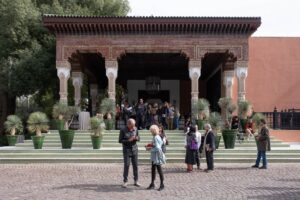
![1-54 Contemporary African Art Fair Marrakech]()
Morocco: a playground for progressive art: 1-54 in Marrakech
-
![Smileys van Maria Roosen]()
Li’s Forecast #7: Solid Energy
-
![]()
Chef’s Favourites: Books, films, restaurants and recipes
-
![Alymamah Rashed in haar studio | © Mateusz Stefanowski, courtesy Dior]()
A landscape, archive and statement: The iconic Lady Dior reimagined by artists
-
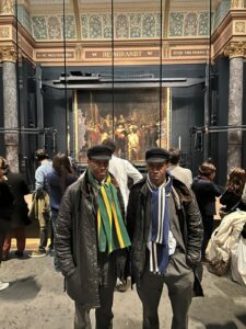
![The Islington Twins in front of Rembrandt's Nightwatch at the Rijksmuseum, Amsterdam, 7 December 2025]()
A Weekend with The Twins: In Amsterdam
-
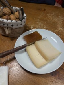
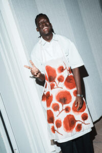
![Chef Mory Sacko, guest-curator of See All This #40, wearing one of the hand-painted aprons at See All This' Dinner Party, 6 December 2025 | photo: Katerina Bezede]()
A Taste of Mory’s Magic: Recreate His Festive Soup Dish at Home
-
![The Islington Twins for Burberry]()
Fruits, Fats & Fundaments: Lessons in Nutrition from the Streets of London
-
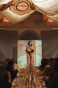
![The Dinner Party, 6 december 2025, Felix Meritis Amsterdam | foto: Katerina Bezede]()
The Dinner Party: 10 Years See All This
-
![]()
The Gentle Radicalism of Eating Together: A Night with The Macallan at Flore
-
![Nicole Ex tijdens haar speech, The Dinner Party, See All This, 6 december 2025]()
10 years of See All This: ‘Do you like the party?’
-
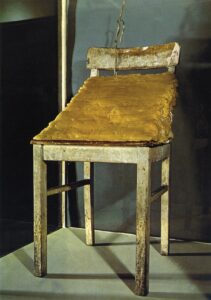
![Joseph Beuys, Fat Chair, 1964, fat, wax, barbed wire, wooden chair, 41.6 x 94.5 cm]()
Feeding the Eye: A Visual Banquet
-
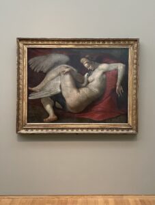
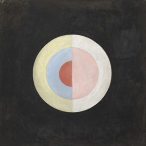
![Hilma af Klint, De zwaan, serie
SUW/UW, groep IX: deel I, nr. 16, 1915, olieverf op doek, 154,5 × 154,5 cm]()
Why Doctors Are Prescribing Art: 10x When Art Becomes Medicine